
The rulebook is a pleasant surprise. A lot of the scenery used in the photographs is stunning, the miniatures are superbly painted, and the whole atmosphere just blew me away. Mind you, I haven't read all of the rules yet, but the whole lay-out, the imagery, the spirit the book embodies is something that woke up into me the same excitement I felt when I first read the WH40K Rogue Trader book back in the late eighties.
One of the images of the original WH40K book that appealed to me tremendously, was one in which a modern looking cityscape with brightly coloured skyscrapers served as the scenery for a game. It wasa photograph in the back of the book, in the "Modeling and Painting" section, but it was exactly the visual look of a scifi universe I wanted to play games in.

Later on, the WH40K look-and-feel became more and more gothic and dark, and that didn't appeal to me at all. I guess I am more a hard scifi fan rather than a gothic scifi fan. More Traveller and StarGrunt than WH40K.
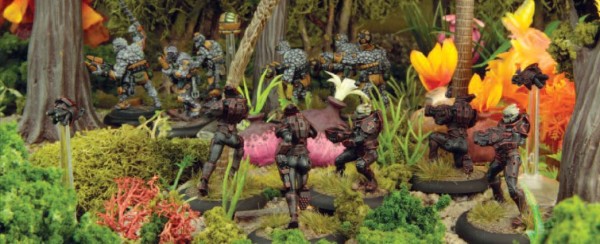
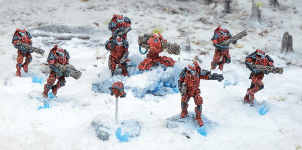
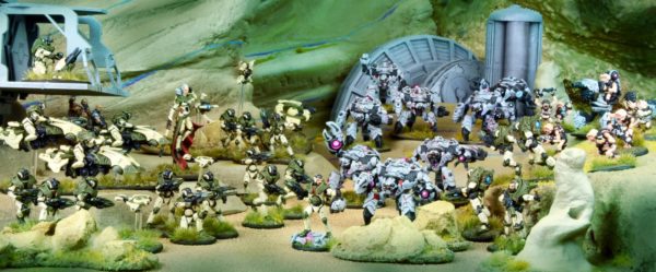
Anyway, I see the same visuals for scenery and setting in the photographs in the Antares rulebook. Bright figures, in brightly coloured settings. For some reason, such a setting is much more inviting to play a game in.
 |
| (warlordgames.com) |
 |
| (warlordgames.com) |
 |
| (warlordgames.com) |
Curious to hear what you think of the rules when (if) you do read them. I've read some awful (and very well reasoned) reviews so far.
ReplyDelete